Jeneponto, Sulawesi Selatan, Indonesia

Delko Generation Presents, You Can Download an Application and Information About The World

Jeneponto, Sulawesi Selatan, Indonesia

Delko Generation Presents, You Can Download an Application and Information About The World

Jeneponto, Sulawesi Selatan, Indonesia

Delko Generation Presents, You Can Download an Application and Information About The World

Jeneponto, Sulawesi Selatan, Indonesia

Delko Generation Presents, You Can Download an Application and Information About The World

Jeneponto, Sulawesi Selatan, Indonesia

Delko Generation Presents, You Can Download an Application and Information About The World

Thursday 31 October 2013

Cartoon Effect #TutorialPS


1.   Pertama-tama persiapkanlah dahulu apa-apa saja yang dibutuhkan untuk memulai peng-editan.
  • Software Photoshop (saya menggunakan CS5)
  • Foto yang akan diedit
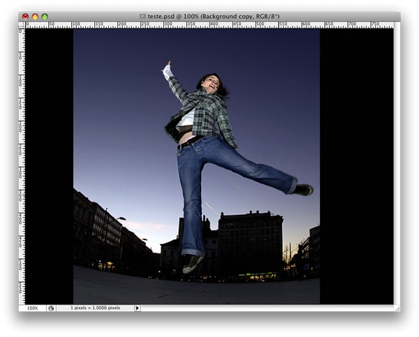
2.   Jika sudah, masukkan foto ke software Photoshop dengan cara, klik File – Open – “carilah foto yang akan diedit”-Open
3    Kemudian gantilah resolution gambar menjadi 300 pixels/inch dengan cara, klik pada menu Image – Image Size “gantilah resolutionnya” – Ok
 
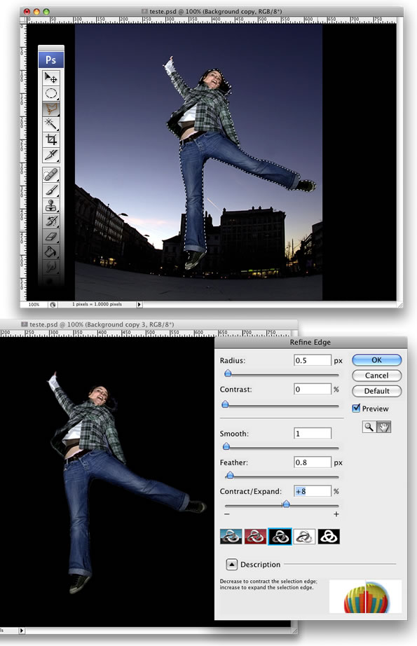
4.     Kemudian buatlah minimal 2 layer baru ( 1 layer sebagai background warna putih, dan 1 lagi sebagai Sketchline nya )
Sketchline : gambar yang berupa terdiri dari garis hitam yang membentuk suatu objek diatas background.
gantilah nama layer dengan cara double klik atau klik kanan pada layer lalu piliih layer properties.
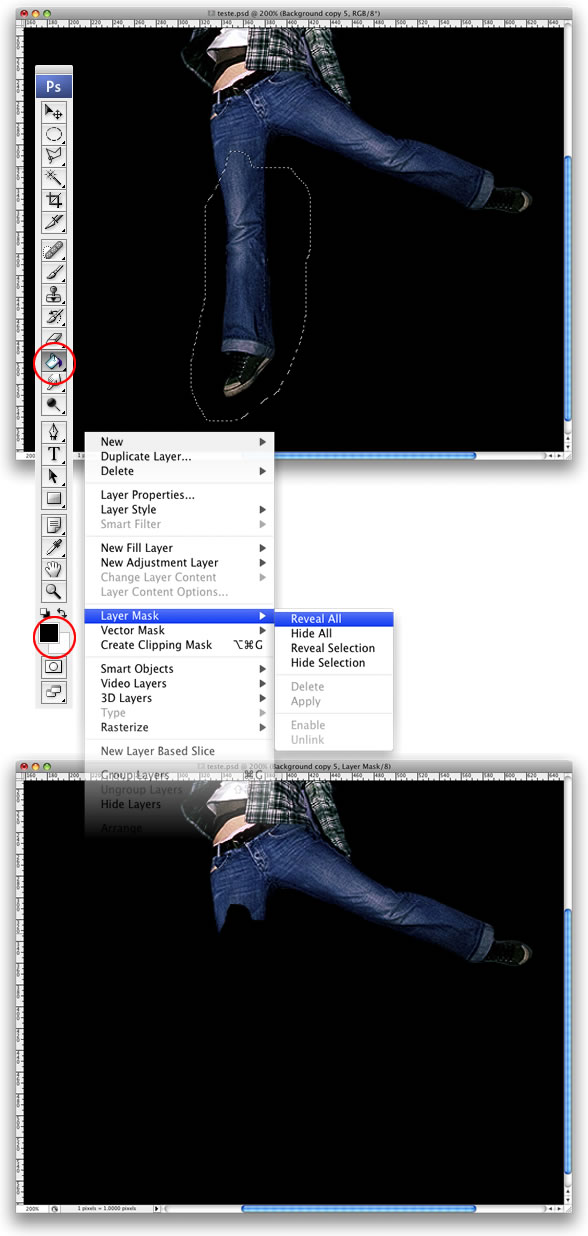
5.    Agar layer background berwarna putih gantilah foreground color (putih), kemudian dengan menu Pain Bucket Tool klik pada layer background dan klik lagi pada gambar. Hingga layer background berubah menjadi putih.
Coba lihat pada kotak biru dan merah ada tidak perbedaan??
iy benar sekali, jika terdapat tanda pada layer maka anda telah menginginkan melihat gambar atau image dari layer tersebut, dan jika tidak ada tanda pada layer maka anda tidak menampilkan gambar atau image dari layer tersebut.
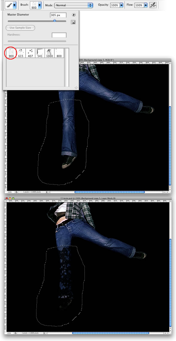
6.    Setelah itu sesuaikan ukuran brush dan warna foreground (hitam)
  • Untuk ukuran brush jangan terlalu besar
  • Set Foreground Color (hitam)
7. Nah sekarang kita sudah masuk ke tahap pembuatan skecthline nya. Untuk memulai pembuatan sketchline nya pilih menu Pen Tool.
dengan menu Pen Tool klik sambil digeser pada gambar hingga membentuk lengkungan yang diinginkan seperti pada gambar.
setelah itu, untuk membuat garis hitam nya. klik kanan pada gambar (masih menggunakan Pen Tool) kemudian klik Stroke Path maka akan muncul sebuah form Stroke Path pilih Tool : Brush, Simulate Pressure (jangan dicentang) – klik Ok.
untuk melihat hasilnya, berilah tanda pada layer background kemudian klik kanan di gambar (masih menggunakan Pen Tool) -  klik Delete Path
maka akan terlihat seperti ini.
hilangkan tanda pada layer backgorund, seperti pada gambar di bawah ini.
Background yang berwarna putih sama sekali tidak kelihatan. ini berarti anda telah melakukan perinta untuk tidak ingin menampilkan gambar yang ada pada layer background tersebut.
Kemudian lakukanlah hal ini lagi untuk membentuk sketch line lainnya. hingga selesai dan akan terlihat seperti ini.
Coba anda lihat pada tiap layer, terdapat pemberian nama pada masing-masing bagiannya. Hal ini berfungsi untuk memudahkan anda untuk penandaan dalam layer apa bagian dari layer tersebut. Lakukan pemberian nama layer ini pada tahap selanjutnya hingga selesai.
8.    Tahap selanjutnya kita akan melakukan pemberian warna pada tiap bagiannya. Hal ini mudah dilakukan dengan menggunakan menu Brush dan Set Color Foreground lagi kemudian mulailah mewarnai satu persatu, bagian demi bagian, layer demi layer.
Buatlah layer untuk pewarnaan dalam bagian wajah. Kemudian berilah nama layer “Skin Face”
Setelah itu, untuk mendapatkan efek pencahayaannya ubah dahulu Foreground Color dan Background Color nya.
Kemudian lihat pada layer properties di kanan anda. Pilih layer Skin face kemudian lihat di bawahnya klik fx, silahkan pilih Gradient Overlay
Sesuaikan settingan pencahayaannya pada bagian ini. Hingga hasilnya akan terlihat seperti ini.
Sebelum dan sesudah pencahayaan terdapat perbedaan yang mencolok.
Lakukan hal ini pada bagian lainnya seperti pakaian, rambut, dan skin body lainnya dan jangan lupa untuk melakukan pemberian nama bagian pada tiap layer. Hingga gambar seperti ini.
Di sini Anda dapat melihat beberapa penggunaan layer dalam tiap bagian yang digunakan.
pada tahap ini kita telah selesai dalam melakukan pewarnaan. Selanjutnya kita akan memasuki tahap pemberian Effect Vector yang berfungsi untuk memberikan efek bayangan pada gambar. Di sini saya hanya menjelaskan bagaimana cara pembuatannya dengan simple dan mudah, untuk mendalami teknik ini sangat di anjurkan untuk melakukannya sendiri dalam pengembangannya.
ok, kalau begitu kita langsung saja mulai pemberian Effect Vector.
1.    Buatlah layer untuk bagian vektornya seperti pada gambar.
Kemudian klik pada layer Vektor dan gunakan menu Pen Tool lagi untuk melakukan pembuatan Vektor hanya saja kali ini kita tidak akan menggunakan Stroke Path seperti yang tadi, tapi kali ini kita akan menggunakan menu Fill Path.
Cari bagian foto yang terdapat bayangan halus, kemudian buatlah lengkungan atau daerah Fill dengan menggunakan Pen Tool seperti pada gambar.
Kemudian klik kanan di gambar (masih menggunakan Pen Tool) lalu pilih Fill Path lalu klik Ok.
Warna Fill Path berpengaruh dengan warna Foreground Color yang sedang digunakan, maka dari itu ganti lah dahulu Foreground Color menjadi warna hitam sebagai dasar pembelajaran. Maka akan terlihat seperti pada gambar.
klik kanan di gambar (masih menggunakan Pen Tool)
pilih Delete Path untuk menghapus Fill Area yang Anda buat tadi dengan menggunakan Pen Tool. Setelah itu klik bagian bawah di kanan anda pada layer properties tanda ” fx “ lalu pilih Blending Option.
Lalu akan muncul form Blending Option. Sesuaikanlah Opacity (tingkat transparan objek) untuk mendapatkan efek bayangan yang sesuai dengan selera Anda.
Berikut adalah hasilnya yang merupakan vektor atau bayangan dari sebuah objek.
Lakukanlah hal ini hingga semua gambar terlihat sempurna seperti pada gambar di bawah ini.
Vektor tanpa kartun efek.
terdapat beberapa layer yang digunakan untuk membuatnya.
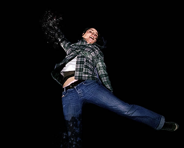
Vektor dengan kartun efek. Gambar terlihat seperti aslinya.

ColdPlay Apple #TutorialPS

Coldplay / Apple Style Portrait

This tutorial will show you how to create a portrait based on the style of the latest Coldplay / Apple Ad featuring “Viva la Vida” from Coldplay. In case you’re not familiar with the commericial I’m referring too, findthatsong has uploaded a copy of it onto YouTube.
Here’s a quick look at what we’re going to create:
Coldplay / Apple Style Preview
Before going any further, I’d like to give a quick shout out to Fabio who wrote an awesome tutorial for a similar effect based on the same ad. Maybe I’m not the only Coldplay fan out there!
Time to begin!

Step 1 – Create the Document

Begin with a document sized to your liking. I’m working at around 750x450px myself, but the exact size really doesn’t matter.
What does matter is the background color though. Using the Paint Bucket Tool, fill your background layer with a dark (nearly black) green or blue (#010500).

Step 2 – Adding Light

Create a new Layer.
Using a large, white, soft brush (500-1000px, 0% Hardness), paint the lower part of your image. The brush should basically extend from the very bottom of your canvas in all direction to the other edges of the canvas.
Lower the Opacity of your new layer to around 70%.
Background with a Soft Glow added

Step 3 – Coloring the Light

For this step, we’re going to be playing with a similar effect that I discussed in my Unique Abstract Website Header Photoshop TutorialCreate a new Layer, and select a large (400-600px), soft, orange (#f38c11) brush. Paint a large dab to fill the bottom right of the canvas.
Now select a light blue (#2afaf0) and paint in the bottom left of the canvas.
Finally, fill in the top center of the canvas with a shade of purple (#c94ce1).
Set this layer to Overlay.
Color the Light in the Background

Step 4 – Adding some Highlights

Create a new Layer.
Using the Brush Tool, and a small (30-60px) soft, white brush, paint a few lines curving around the center of your canvas. Apply a Radial Blur (Filter > Blur Radial Blur), using the Spin blur method with an amount between 50-70. Set this layer to Overlay.
Add highlights with paint and a radial blur filter

Step 5 – Insert Photo

Desaturate the Subject
Time to add a photograph of our subject into the portrait. Going over the process of cutting out a subject is out of the scope of this tutorial, but I will suggest using the Pen Tool to prepare such a cutout.
When you have a cutout prepared, Paste it into a new layer in your document. Line it up so that the highlights seem to be coming from behind it.
Destaturate (Images > Adjustments > Desaturate) the cutout so that the subject is black and white on top of the colored light we created earlier.

Step 6 – Dodge and Burn

In the Coldplay / Apple commercial, the subjects are nearly silhouetted with the light bursting out from behind them. However, the photo I chose is pretty clear, as if there is a light source in front of the subject.
If you have the similar problem on your image, you can fix it using the Dodge and Burn Tools.
Grab the Burn Tool (Located underneath the Paint Bucket Tool) from the toolbox, and in the Options Bar, set theRange to Shadows. Using a large, soft brush, paint over most of your subject to darken it. I’m going to leave a bit of the right side of my subject lit up to show that there is some light reflecting off of him.
You can go back with the Dodge Tool to bring out some brighter highlights if you find it helps light up part of your subject.
Dodge and Burn Tools in Photoshop
Finished with Dodge and Burn

Step 7 – Adding the Smoke Effect

There are a few ways we could go about creating smoke in our design (We actually featured an interesting smoke effectin our May Tutorial Roundup), but in this tutorial we’re actually going to use a stock image.
Download the “smoke” stock image from stock.xchng (Requires a free account).
Paste and Transform the smoke stock image so that it’s positioned and sized somewhere over your subject. Set the blending mode for this new layer to Screen.
Smoke Screened on top of subject

Screen Blending Mode

Confused about what just happened? The Screen Blending Mode can be very handy sometimes, as any pixels that are black will essentially become transparent in the blended layer.

Step 8 – Adjusting Smoke Color

Using any of the Selection Tools (Magic Wand Works Great), select the smoke from the stock image. Apply a feather to the selection (Select > Feather) of a 1-3px to soften things up.
Create a new layer, and using the Paint Bucket Tool, fill your selection with a light blue/cyan (#28dff5). Set this layer to Color.
Finished Colored Smoke

Step 9 – Enhancing the Background

Duplicate the Smoke layer (not the color, but the smoke layer – Layer > Duplicate Layer while selected), and move the new layer underneath your subject layer.
Transform the new smoke layer so that it takes up a lot of the background behind your subject. Set this new layer toColor DodgeYou may wish to also apply a slight Guassian Blur to this layer.
Creating a Mystic Background

Step 10 – Add Dark Lines

Steps for creating the Black Lines
Create a new layer underneath your subject. Using the Rectangular Marquee Tool, make a long selection spanning about the width of your canvas.
Fill the Selection using the Paint Bucket Tool with a dark color (black will work fine).
Deselect your selection by going to Select > Deselect (Or Ctrl + D).
Now, Transform your black rectangle (using Free Transform, Scale, Rotate, Perspective, or any mix of those you are comfortable with). We want the side of the bar that is going to be underneath our image to be more narrow than the end coming out of our subject (similar to a sunburst effect).
Use the Move Tool to reposition your bar. Set the blending Mode to Overlay. You may consider fading your bar out like I did with a large, soft eraser.
Add a few more of these bars using the same technique.
Black Bars added to the Design

Time for Polish

At this point, you’ve finished the effect we were aiming for! You don’t have to stop here of course. If you’re going to continue playing with the design, and adding your own finishing touches, here are a few suggestions that may get you started:
  • Add a Vignette – Fade out your borders to a dark black color. Since we’re designing a portrait in this tutorial, it’s a really nice way to frame your subject!
  • Add some abstract dust – We’ve got a brilliant Photoshop tutorial for adding Abstract Dust and Spray Effects to designs like this which you may be interested in!
  • Play with Text – Some clever text placement can really add a lot to a design! White text seems to look really great on top of this effect, especially if you’re using a blocky Type.
As usual, you can grab the PSD Sample to play with and see how we went about doing certain things!
And here is another example of the style put to good use!
Ocean is Theory Sample

Seriously Cool Photoshop Explosion Effect #TutorialPS

Explosions are cool. Seriously cool. So when I received some e-mails asking about how to create a break-apart, explosion effect, I knew it’d be worth making a tutorial on. Read on to find out how to break apart a body, then add some awesome lighting and glow, and nopattern style, to finish the image off.

Step 1

Create a new document, any size. I used 800x600px. Fill the background layer with black. After that, place your photo in the center of the document.

Step 2

Select the Polygonal Lasso Tool (L) and select the girl. When you complete the selection process, go to Select > Refine Edge. A dialog box will open with some settings. Select to preview the image on black, and make some adjustments until you find a nice result. Add a bit of feather, radius, and expand the selection. Then press OK.

Step 3

Invert the selection, Select > Inverse and delete the background of the photo. After that, go to Filter > Sharpen > Sharpen and the Filter > Noise > Add Noise. Set 2% for the noise amount.

Step 4 - Breaking Apart

With the Lasso Tool (L), select the girl’s leg like I did, then go to Layer > Layer Mask > Reveal All. After that, select the Paint Bucket Tool (G) and fill the selection with black. Make sure that you paint the selection.

Step 5

Here we will need some brushes. You can find good brushes at brusheezy.com. I used a set of brushes called Blood-grunge.
Select the Brush Tool (B) and white for the color. Pick one of the brushes. I used the first one of the set and reduce its size to 300 or less. After that, start painting the hidden leg. You will need just a few clicks with the brush tool to get a good result.

Step 6

The previous step broke apart the leg, but the shatters didn’t spread like a real explosion. So in order to do that, we will use the Clone Stamp Tool (S).
Create a new layer above the girl’s layer and select the Clone Stamp Tool. Choose Current & Below in the Sample settings. If you have never used the Clone Tool before, the first thing to do is define a source point. To do that hold the Alt key and select the source point. After that, start cloning some parts of the exploded leg to spread the shatters. The last thing here is go to Filter > Sharpen > Sharpen.

Step 7

Repeat the Steps 4, 5, and 6, but select the arm this time to break apart.

Step 8 — Clouds

Add a new layer on top of the others. Select white for the foreground color and black for the background. Then go to Filters > Render > Clouds. Now select the Lasso Tool. Set the feather to 20px, and select an area around the girl. You will have a selection like the image below. After that, just go to Layer > Layer Mask > Reveal Selection.

Step 9

Double-click on the clouds layer to open the Layer Styles dialog box. The first thing to do here is use Screen for the Blend Mode and use 28% for the Fill Opacity. Then select Gradient Overlay. The Blend Mode will be Color Dodge this time with 55% Opacity. Use the same colors as the image below.

Step 10 — Lighting Effects

I used some brushes to create the light effects. You can find them here:http://r0man.de/kostenlose_brushes_photoshop.htm.
Create a new folder above all the other layers, rename it to “lights” and change the Blend Mode to Color Dodge. Then select white for the color and the Brush Tool. Test some brushes to see the result. Create a layer for each effect.

Step 11

Create a new layer inside the “lights” folder. Select the Rectangular Marquee Tool (M), making sure the Feather is 0px. Create a rectangular selection. Then select the Gradient Tool (G). For the colors, use white for both start and end, but change the end’s opacity to 0. Then just fill the rectangle with the gradient like in the image below.

Step 12

Select the Elliptical Marquee Tool (L) and use 10px for the Feather. Create an elliptical selection like the image below. The just go to Layer > Layer Mask > Reveal Selection.

Step 13

Duplicate the layer and go to Edit > Transform > Flip Vertical. Then go to Edit > Transform > Scale and reduce the height only. After that, just group these two layers. You can create more lights just by duplicating the group, rotating, and scaling it.

Step 14 — Illustrator

In Illustrator select the Pen Tool (P) and create two curved lines To do that, hold the button every time you click to create a curved point. Use 0.5pt for the stroke weight. After that, select the Blend Tool (W) and click over one line and then on the other. To change the blend properties, just double-click on the Blend Icon. Choose Specific Steps for the Spacing and use like 50 steps. Copy the blend.

Step 15

Back to Photoshop, paste the blend over the girl. After that, select the girl’s body. To do that, just click over the girl’s icon on the layer palette holding Cmd (mac) or Ctrl (PC), which will select only the girl’s body. Then go to Layer > Layer Mask > Hide Selection. That will hide the parts of the blend that are in front of the girl.
Open the Layer Style dialog box, change the Fill Opacity to 0 and select Gradient Overlay. Use 20% for the Opacity and use the rainbow colors, like in the image below.

Conclusion

There are lots of different ways to do the break-apart effect. I chose the one that was, in my opinion the fastest and easiest one. You can see that I spent more time creating the lighting effects than doing the break apart effect.